Grid Mockup for Website Screenshots
Tile several website screenshots into one clean wall, flat or tilted in 3D. A free grid mockup generator for portfolios, project showcases and launch posts, with no watermark.
6 min read · Published
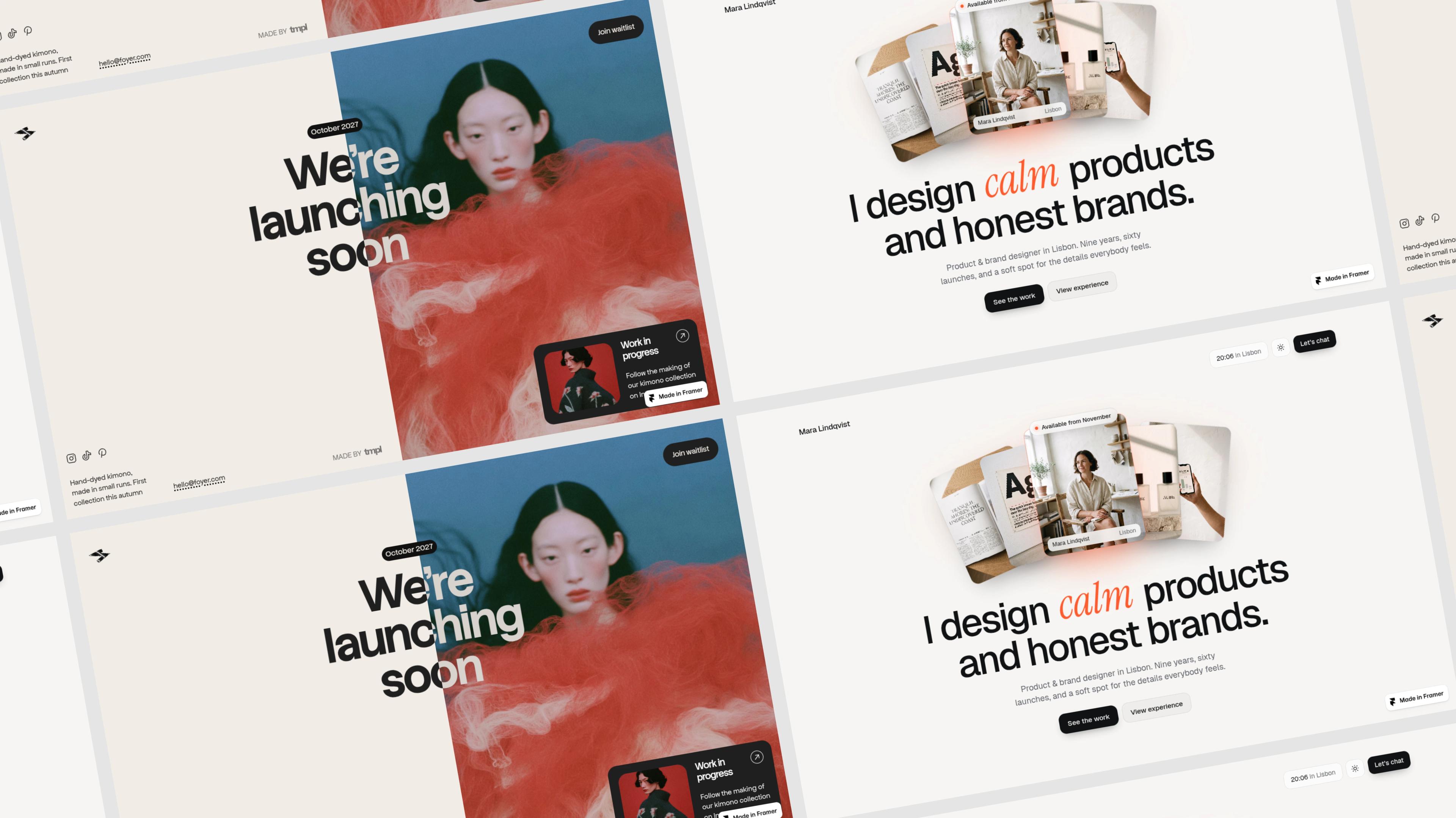
One website screenshot shows one page. A grid mockup shows the whole project: the homepage, the pricing page, the blog and the dashboard, tiled into one wall that reads as a body of work. It is the image you see at the top of agency portfolios, template listings and launch posts, and it is quick to make once your screenshots are ready.
This guide shows how to create a website screenshot grid online with Mockship's grid mockup generator, which grid to pick, and how to get every tile looking sharp.
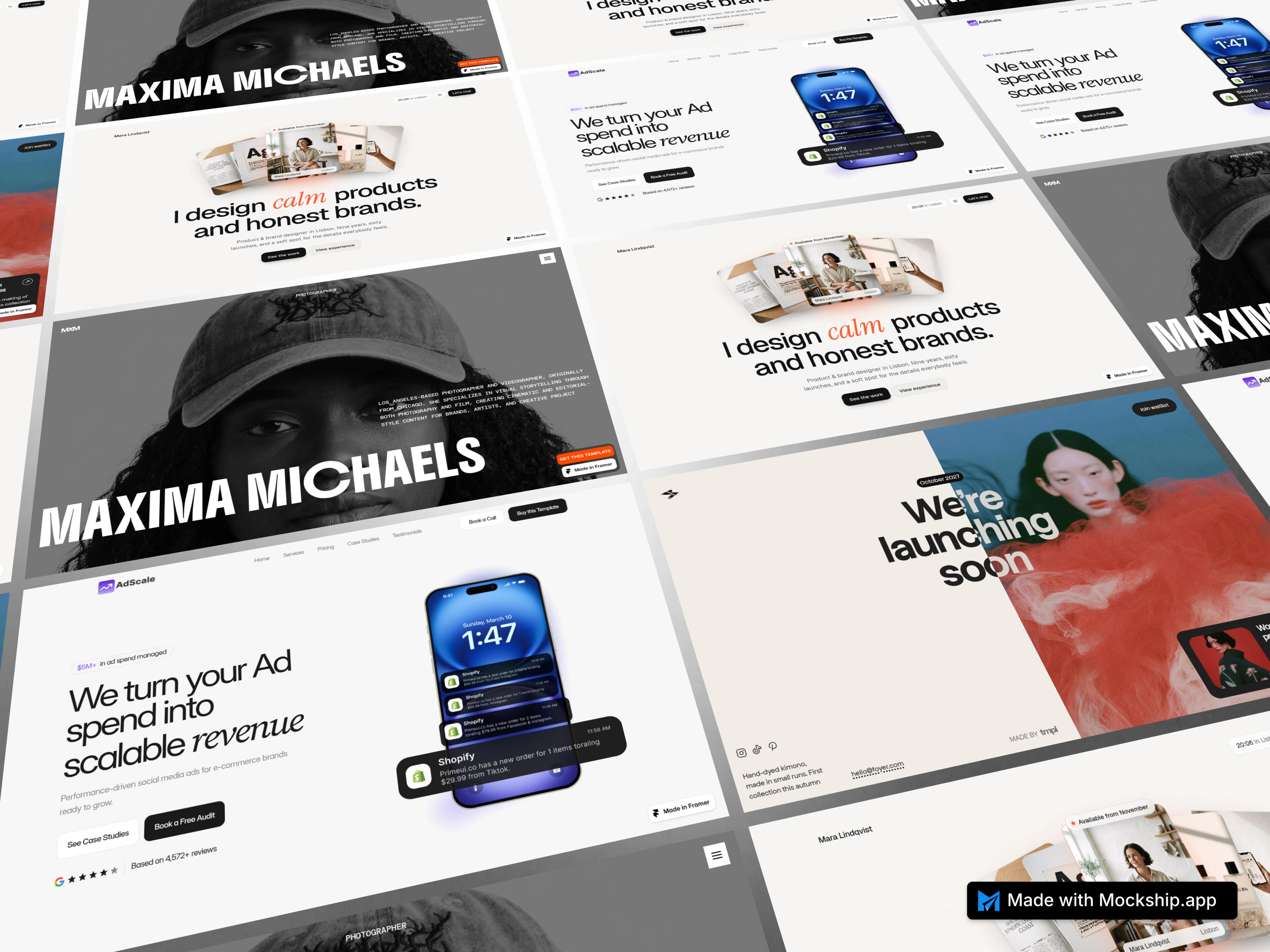
What is a website screenshot grid mockup?
A website screenshot grid mockup places several page screenshots in even rows and columns, with the same gap between every tile. Flat, it reads like a tidy contact sheet. Tilted or put in perspective, it becomes a wall of screens that gives a project depth and scale. Either way, the viewer sees many pages in one glance, which a single screenshot can never do.
It sits between a screenshot collage and a device mockup. Like a collage, it combines multiple website screenshots in one image. Like a mockup, every tile shares the same size, corner radius and shadow, so the result looks designed rather than pasted together.
How to make a website screenshot grid mockup
- 1
Capture your pages
Take a screenshot of each page at the same browser width. 1440 by 900 pixels matches a tile's 16:10 shape exactly, so nothing important gets cropped.
- 2
Open Grid Mockup
Open the grid mockup in the studio. It starts on the 2x2 grid, which is free to export.
- 3
Add your screenshots
Click any tile to upload, or use Add media in the media picker. You can select several screenshots at once, and they fill the empty tiles in order, starting from the tile you clicked.
- 4
Choose what goes where
Click a tile, then pick a screenshot from the media picker to place it there. Put your strongest page somewhere central, where the eye lands first.
- 5
Pick a grid and a layout
The first tab at the top of the left panel holds the 2x2 and 3x3 layouts, the second holds Staggered. Choose a layout preset such as Flat, Tilted or Perspective, and use Zoom to make the tiles smaller.
- 6
Fine-tune and export
Open Adjust to set rotation, tilt and the gap between tiles, choose a backdrop, then export a PNG or JPEG.
Which grid to use: 2x2, 3x3 or Staggered
| Grid | Screens | Best for | Plan |
|---|---|---|---|
| 2x2 | 4 | A small project, a template with four key pages, a clean hero image | Free |
| 3x3 | 9 | A full portfolio, a design system, a large site with many pages | Free |
| Staggered | 6 | A dynamic showcase; every other column shifts down by half a tile | Pro to export |
If you only have three or four strong pages, use 2x2. A 3x3 grid with repeated screenshots looks padded, while four good pages in a 2x2 look confident.
Layout presets: flat, tilted, perspective and isometric
Flat
Straight rows with no rotation. The cleanest choice for portfolios and case studies, where the pages themselves should do the talking.
Tilted and Tilted Right
The whole grid rotates 10 degrees to the left or right. Adds movement without hiding any content.
Perspective
A slight rotation plus a backward tilt, so the grid leans away like a wall of screens. The most popular look for launch posts and hero images.
Staggered Isometric
A strong 3D angle on the staggered grid. Eye-catching for social posts and covers, though small text becomes harder to read.
Every preset is a starting point. Adjust lets you set rotation anywhere from -60 to 60 degrees, tilt from 0 to 60 degrees, and the gap between tiles, so you can land on your own angle.
How the grid fills the canvas
Every grid runs past all four edges of the image, repeating your screenshots around the outside so there are no empty corners at any angle. The tiles you choose stay in the middle, where the eye lands, and the repeats simply frame them.
Tips for a clean website portfolio grid
Capture at one width
Screenshots taken at different widths make text sizes jump from tile to tile. Pick one width, such as 1440 pixels, for every page.
Lead with the top of the page
Tiles show the top of each screenshot, so the hero section is what people see. Make sure each page's header is clean and loaded.
Mix page types
Alternate busy pages with simple ones, and light pages with dark ones, so the grid has rhythm instead of a wall of similar layouts.
Keep the gap small
A tight gap makes the grid read as one piece. Widen it only when your screenshots share a background colour and the tiles start to merge.
Match the backdrop to the work
The backdrop shows through the gaps between tiles. A soft gradient that picks up your brand colour ties the tiles together.
Sizes for sharing a grid mockup
| Where it goes | Canvas size | Tip |
|---|---|---|
| X post | 1600 × 900 | Perspective layouts fill the wide frame well |
| 1200 × 627 | Keep the gap small so tiles stay readable | |
| Dribbble | 1600 × 1200 | A flat 3x3 shows a whole project |
| 1080 × 1080 | The grid fills the square with no empty corners | |
| Link preview | 1200 × 630 | 2x2 keeps each page large enough to read |
Every size above is a canvas preset in the studio. Pro adds 4K and 6K export, which keeps small text in a 3x3 grid sharp on large screens.
When a grid is not the right mockup
A grid is for showing many pages at once. To show one page in detail, a single browser mockup with your domain in the address bar reads better. To show a whole long page from top to bottom, use the full-page screenshot layout instead.
Frequently asked questions
Related tools and use cases
Tags
Share
More from the blog
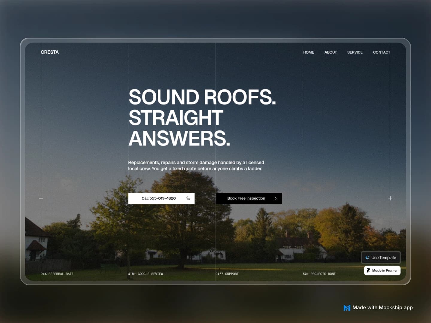
Framer Website Mockup Generator: Showcase Your Framer Site
Turn a published Framer site into polished showcase images for your template listing, portfolio or launch post. Browser windows, MacBook frames and full-page layouts, free and with no watermark.
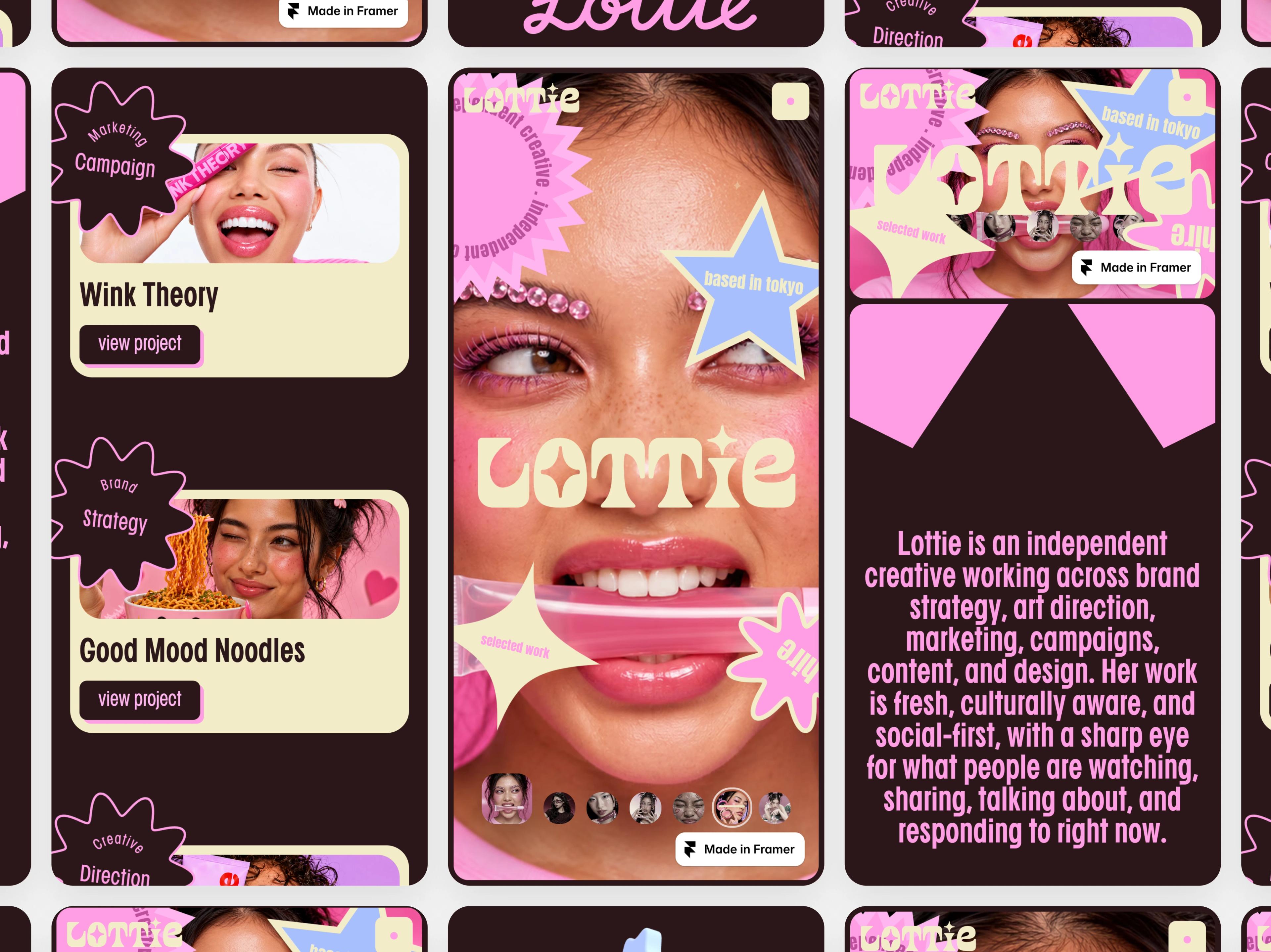
Grid Mockup for Mobile App Screens
Tile your app screens into one phone grid mockup, flat, tilted or diagonal, with or without real iPhone frames. Free to make online, HD export and no watermark.
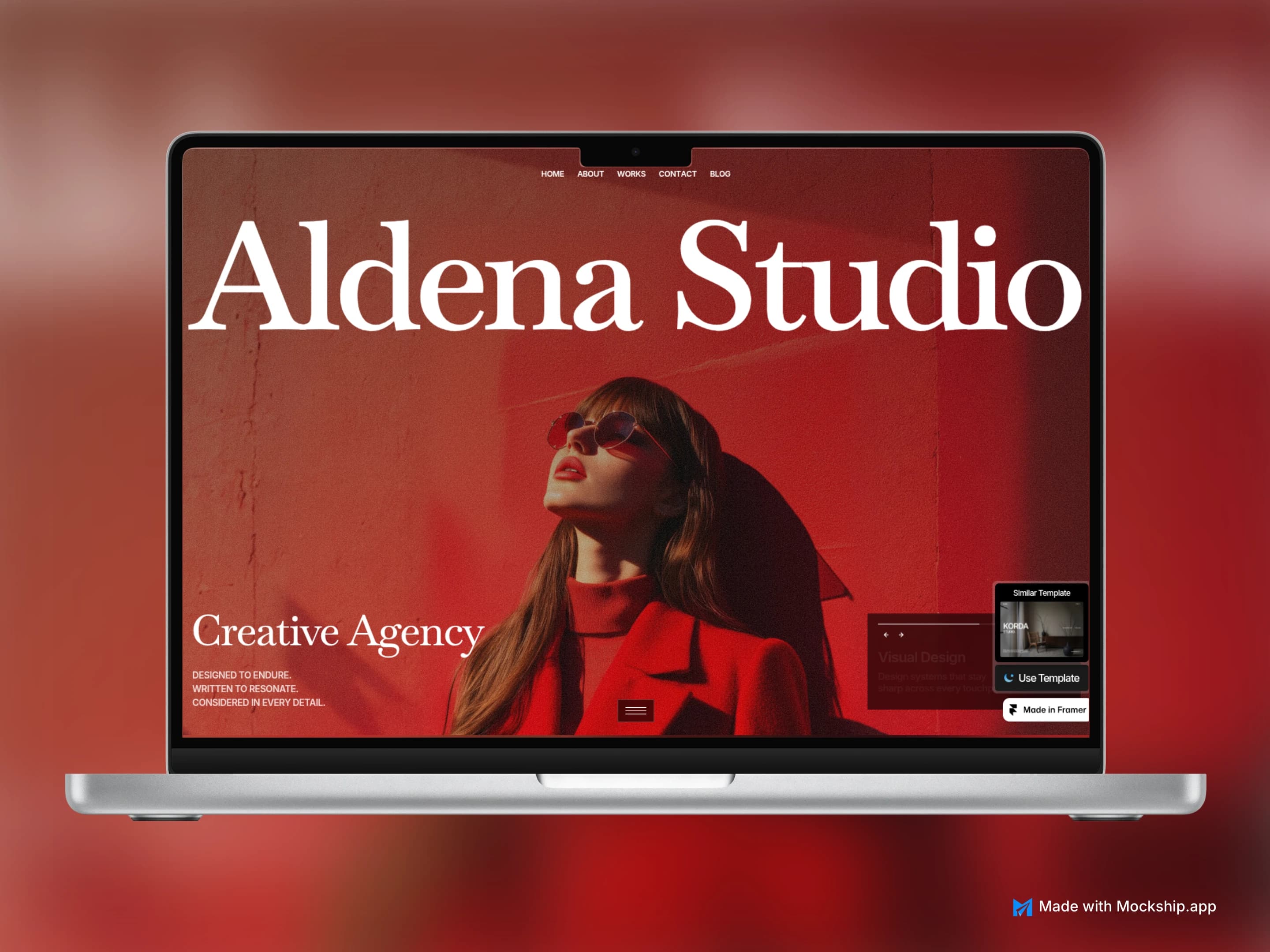
Make a MacBook Mockup Online for Free
Drop a screenshot of your website or app into a real MacBook Pro frame, pick a backdrop and export a sharp image in under a minute. No Photoshop, no signup, no watermark.