Grid Mockup for Mobile App Screens
Tile your app screens into one phone grid mockup, flat, tilted or diagonal, with or without real iPhone frames. Free to make online, HD export and no watermark.
7 min read · Published
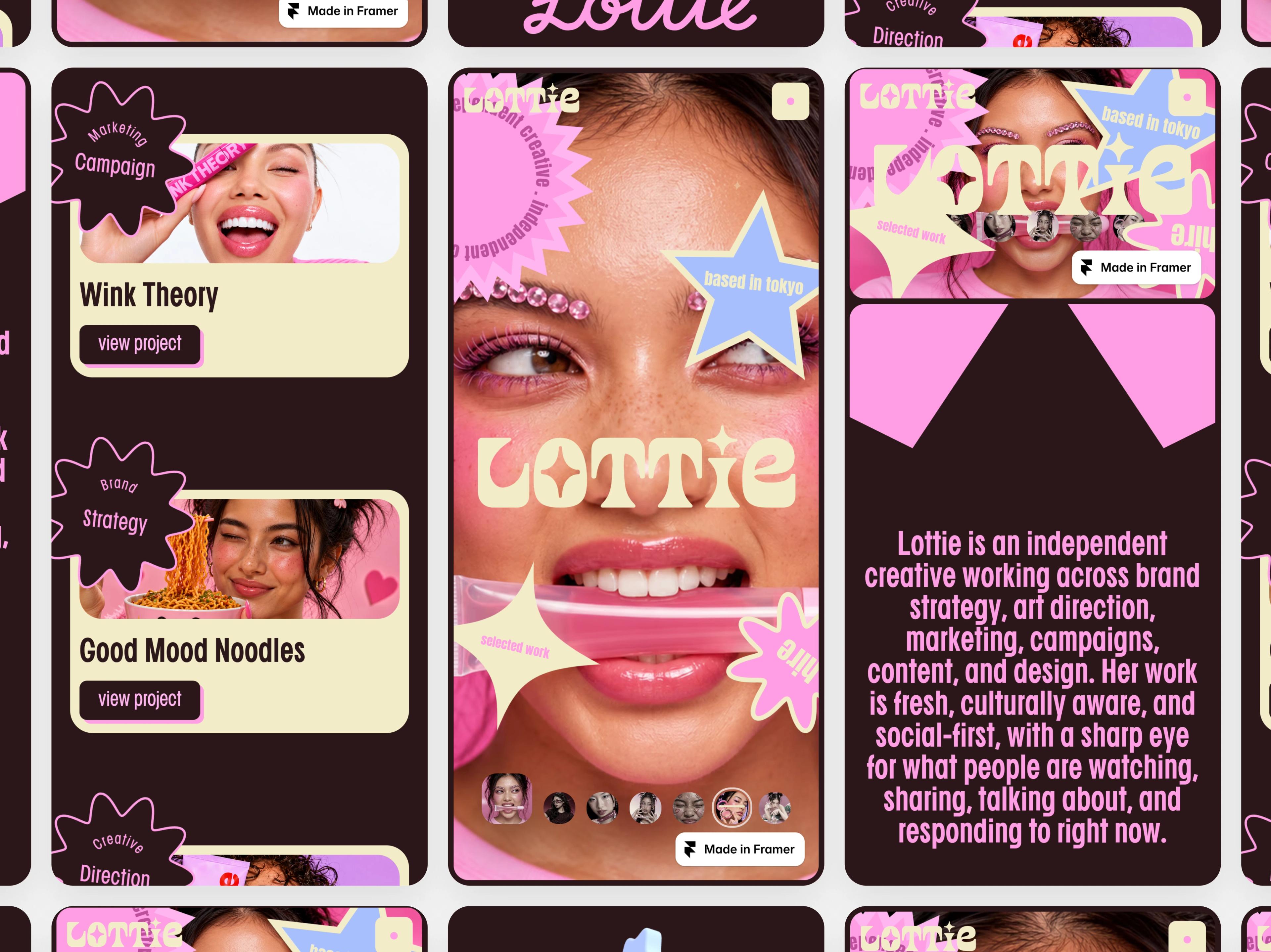
One phone screenshot shows one screen. A grid mockup for mobile shows the whole app: onboarding, the home feed, the profile and the settings, laid out as a wall of phones that reads as a finished product. It is the image at the top of App Store promo pages, Dribbble shots and launch posts, and it no longer needs a PSD file to make.
This guide shows how to make a phone grid mockup online with Mockship's phone grid, which layout to pick, when to add a real iPhone frame, and how to keep every screen sharp.
What is a phone grid mockup?
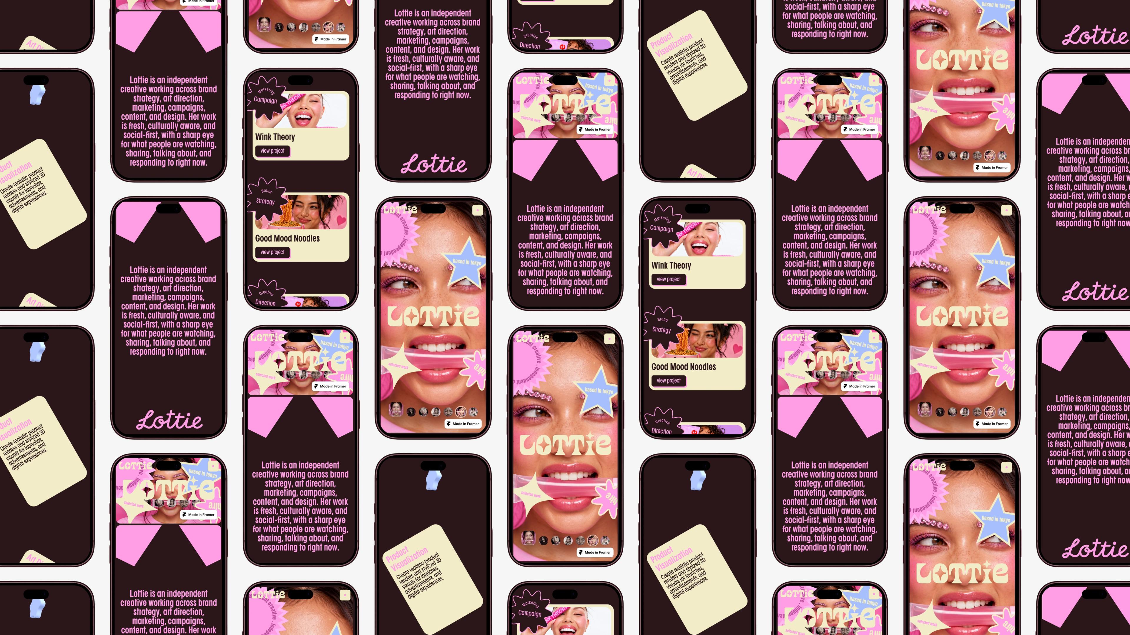
A phone grid mockup places several app screenshots in rows of phone-shaped tiles, with the same gap and the same corners on every screen. Flat, it reads like a clean contact sheet of your app. Tilted, staggered or turned on a diagonal, it becomes a wall of screens that gives the app depth and makes people stop scrolling.
Most mobile mockup grids you find online are Photoshop files: you download a PSD, open each smart object and paste a screen into it. An online generator skips that. You drop your screenshots in, and the grid, the spacing and the phone frames are done for you.
How to make a grid mockup for mobile
- 1
Take your screenshots
Capture each screen on the same phone, or the same simulator size, so the status bar and text sizes match from phone to phone.
- 2
Open Phone Grid
Open the phone grid in the studio. It starts on Row of 3, which is free to export.
- 3
Add your screens
Click any phone to upload, or use Add media in the media picker. You can select several screenshots at once, and they fill the empty phones in order.
- 4
Choose what goes where
Click a phone, then pick a screenshot from the media picker to place it there. Put your strongest screen in the middle, where the eye lands first.
- 5
Pick a layout and a device
Choose a layout on the left, then pick a phone frame, or None, in the Device section of the Mockup tab on the right.
- 6
Fine-tune and export
Open Adjust to set rotation, tilt and the gap between phones, use Zoom to show more of the wall, choose a backdrop, then export a PNG or JPEG.
Phone grid layouts: free and Pro
| Layout | Phones | Looks like | Plan |
|---|---|---|---|
| Row of 3 | 3 | Three large phones side by side; Flat, Tilted or Perspective | Free |
| 3x2 | 6 | Two rows of three; Flat, Tilted, Tilted Right or Perspective | Free |
| Staggered | 10 | A wall where every other column shifts down by half a phone | Pro to export |
| Staggered Isometric | 10 | The staggered wall turned and tipped back, like phones on a table | Pro to export |
| Staggered Diagonal | 10 | Big phones on a diagonal with a larger hero phone in the centre | Pro to export |
| Herringbone | 10 | A zig-zag wall where half the phones are turned on their side | Pro to export |
Every layout fills the canvas edge to edge, so there are no empty corners, and keeps the same look whether the canvas is 4:3, 16:9, square or tall. If you have three great screens, Row of 3 shows them large. If you have five or six, 3x2 shows the whole flow without repeating.
With or without a phone frame
The Device section decides what each phone looks like. None gives clean rounded screens, which keeps the focus on your UI and suits dense, colourful apps. A real device frame makes the grid read instantly as a phone app, which suits App Store promos and launch posts.
iPhone 18 Pro and iPhone 17 Pro
The newest iPhone frames, with the Dynamic Island. The best fit for a current iOS app.
iPhone 16 Pro and iPhone 15 Pro
Slightly older, familiar iPhone bodies, useful when your screenshots were taken on those phones.
OnePlus 8 Pro
A slim Android frame with a punch-hole camera, for Android apps or a mixed showcase.
None
Rounded screens with no frame. Change the corner radius, border and shadow in the Mockup tab.
Which screenshot size works best
Each phone is shaped like a modern phone screen, so a normal full-screen screenshot fits with nothing cut off: 1179 by 2556 pixels from an iPhone, or around 1080 by 2400 from most Android phones. A longer, scrolling capture works too; the phone shows the top of it. Desktop or website screenshots are too wide for a phone and get cropped, so use the screenshot grid for those instead.
Tips for an app showcase that stands out
Show a flow, not a random set
Order the screens the way a user moves through the app, from sign-up to the main feed to a detail view, so the grid tells a short story.
Clean up the status bar
A full battery, strong signal and a tidy time such as 9:41 make every phone look intentional. Notifications in the status bar look messy when repeated across a wall.
Mix light and dark screens
Alternating busy and simple screens gives the wall rhythm, instead of a block of similar layouts.
Use one hero screen
Staggered Diagonal makes the centre phone larger. Put your most recognisable screen there.
Match the backdrop to the app
A dark backdrop makes bright app screens glow; a soft gradient in your brand colour ties the phones together.
Sizes for sharing a phone grid
| Where it goes | Canvas size | Tip |
|---|---|---|
| X post | 1600 × 900 | Row of 3 keeps each screen large and readable |
| 1200 × 627 | 3x2 shows a whole app flow in one image | |
| Dribbble | 1600 × 1200 | Staggered Diagonal or Herringbone for a shot that stands out |
| 1080 × 1080 | The layouts fill the square with no empty corners | |
| Product Hunt gallery | 1270 × 760 | Lead with a framed Row of 3 so it reads as an app |
Pro adds 4K and 6K export, which keeps small text on every phone sharp when the image is viewed full screen.
Phone grid or a single phone mockup
A grid is for showing many screens at once. To show one screen in detail, a single iPhone 18 Pro mockup with a backdrop and shadow reads better. To show several website pages in one image, use the screenshot grid, which is built for wide desktop screenshots.
Frequently asked questions
Related tools and use cases
Tags
Share
More from the blog
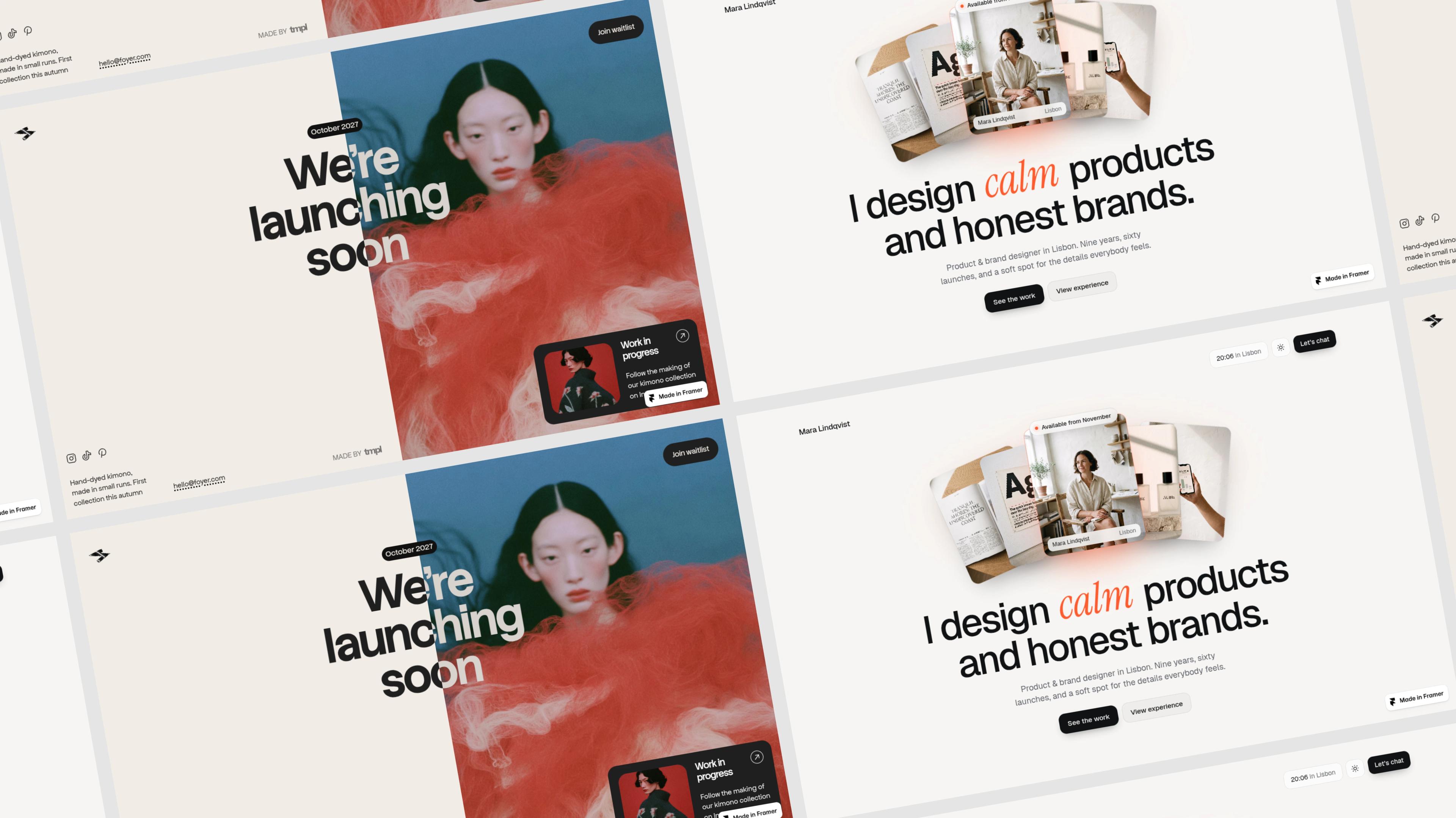
Grid Mockup for Website Screenshots
Tile several website screenshots into one clean wall, flat or tilted in 3D. A free grid mockup generator for portfolios, project showcases and launch posts, with no watermark.
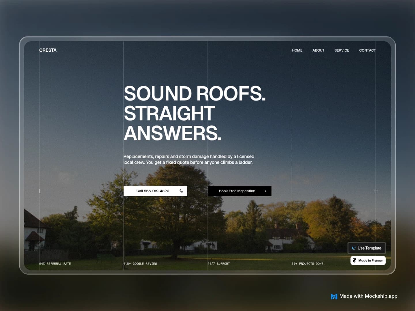
Framer Website Mockup Generator: Showcase Your Framer Site
Turn a published Framer site into polished showcase images for your template listing, portfolio or launch post. Browser windows, MacBook frames and full-page layouts, free and with no watermark.

Make a MacBook Mockup Online for Free
Drop a screenshot of your website or app into a real MacBook Pro frame, pick a backdrop and export a sharp image in under a minute. No Photoshop, no signup, no watermark.