How to Create Beautiful Website Screenshots
What separates a capture that looks like evidence from one that looks designed — the frame, the backdrop, the shadow and the size you export at.
8 min read

A beautiful website screenshot is four small choices, not a design skill: what you capture, what you frame it in, what sits behind it, and how big you export it. Get those right and a plain browser grab turns into something you would put at the top of a landing page or in front of a client.
What follows is the whole process, in the order you actually make the decisions. None of it needs a design tool.
Why a plain capture looks unfinished
It helps to name the problem before fixing it. A raw screenshot is not ugly — it is unresolved. Five things give it away, and once you can see them you cannot unsee them.
It has no edge
The image stops where the capture stopped. With nothing around it, the eye reads it as evidence — a bug report, a receipt, something submitted rather than presented.
It sits flat on the page
Nothing separates the screenshot from the surface behind it. Without depth the design and the background occupy the same plane, and the design stops being the subject.
The shape is wrong for where it is going
A 16:9 capture dropped into a 4:5 feed slot gets letterboxed or cropped, and either way the platform makes the decision instead of you.
The text is soft
Exported at 1× and then scaled up by whatever it lands in. Type is the first thing to fall apart, and it is the thing people were meant to read.
The backdrop fights the page
A saturated gradient behind a saturated site produces two things shouting. The backdrop's job is to hold the screenshot, not to compete with it.
Capture the page clean
Everything downstream inherits the quality of the capture, so this is worth two extra minutes.
- 1
Set the width deliberately
1440 pixels is the safe default. Wide enough that the layout reads as a desktop, narrow enough that the text holds up once a feed scales it down. Capturing at whatever width your window happens to be is how you end up with type that is either tiny or bloated.
- 2
Clear the furniture
Bookmarks bar hidden, cookie banner dismissed, chat bubble closed, notification badges gone. Anything that belongs to your browser rather than to the site is noise in the final image.
- 3
Decide viewport or full page
A viewport capture shows the hero. A full-page capture shows everything and comes out six or eight times taller than it is wide, which needs its own framing treatment.
- 4
Capture at 2× if you can
A retina capture gives you headroom. You can always scale down cleanly; scaling up never recovers what was not there.
- 5
Check the content
Real copy, no lorem, no test data, no placeholder avatars, and no personal email sitting in a form field. This is the step people skip and then notice after publishing.
Choose the frame
The frame is what gives the screenshot an edge and tells the viewer what they are looking at. Pick it for the claim you are making, not for decoration.
A browser window — this is a live site
The highest-credibility option for web work: a browser frame with your real domain in the address bar says the thing exists at an address someone could visit. Safari, macOS, Catalina and Windows styles in light and dark, plus Glass when you want the backdrop to show through. Your favicon is looked up from the domain and lands on the tab.
A laptop or desktop body — this is a product
MacBook, iMac and iPad bodies with real bezels and colourways. More physical than a browser window, and better when the shot is the hero of a page rather than proof that a site is live.
A phone — this is an app
iPhone, Android and Watch frames. Use the device ratio when you capture or the screen looks stretched inside the frame.
No frame — the design is the point
A bare screenshot with generous padding, rounded corners and a shadow. Cleanest option when the audience is designers who do not need to be told it is a website.
The full-page layout — the whole page at once
For tall captures. It frames the strip at a sensible proportion instead of squashing it, and a progressive blur fades the bottom edge so the crop reads as deliberate.
Build the backdrop
The backdrop is where most screenshots go wrong, almost always by doing too much. Work through it in this order and it stays subordinate to the page.
- 1
Let the screenshot pick the colour
The suggested gradients and meshes are built from the colours already in your image, which is why they agree with it. Starting from a colour you like in the abstract is how you end up with a backdrop that fights the page.
- 2
Pick the family
Solid for the most restrained result, gradient for a soft sense of depth, mesh when you want movement without a subject, photo when the shot needs a setting. The Nature and Texture photo sets are free in full.
- 3
Give it room
The frame needs space around it or the composition reads as a crop. If the shot feels tight, add padding before you touch anything else — it fixes more than people expect.
- 4
Add one large, faint shadow
A wide, low-opacity shadow lifts the frame off the surface. A tight dark one under the edge looks like a 2012 presentation template. If you can see where the shadow ends, it is too strong.
- 5
Consider a little noise
A subtle grain or pattern stops a flat gradient looking like an empty fill. The rule is the same as the shadow: if you notice the effect before the page, turn it down.
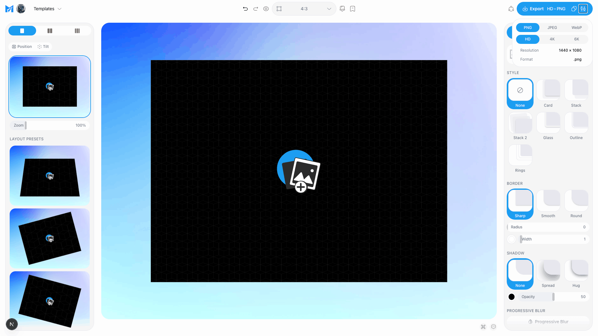
Showing more than one screen
One screenshot shows a feature. Several show a product. When you are presenting work rather than announcing a change, the arrangement does more than any single frame.
Two or three frames together
Set the frame count and the arrangement re-poses the whole group. Angle and tilt add depth; straight on always reads better at thumbnail size.
One backdrop across all of them
A continuous background is what makes a group read as one image rather than three pasted side by side.
A carousel when three is not enough
Design one wide canvas, cut it into panels, and the swipe reveals the next part of a single picture. Better than four separate images for anything that has an order to it.
Export for where it is going
Set the canvas before you export, not after. Composing at the destination's shape is what stops a platform cropping the decision out of your hands.
Your own site
A landing page hero wants headroom for a retina display. Export larger than the slot it sits in, and reach for 4K or 6K when the image runs full width.
X and LinkedIn
1600 × 900 for an X post, 1500 × 500 for a header, 1200 × 627 for LinkedIn. Leave roughly 5% clear on every side — platforms round corners and drop avatars on top.
Instagram and stories
1080 × 1080 square, 1080 × 1920 for a story. Square is the harshest test of whether your composition works without the width to hide in.
Link previews
1200 × 630 for Open Graph. This is the one people forget, and it is the image that represents the page everywhere it gets shared.
Store listings and portfolios
1290 × 2796 for the App Store, 1600 × 1200 for Dribbble. Both are unforgiving about soft text, so export bigger than you think you need.
PNG and JPEG at HD are free, with no watermark and no signup. 4K, 6K and WebP are Pro. PNG for anything with text or a transparent edge; JPEG when the file size matters more than the last few percent of sharpness.
Mistakes worth avoiding
A placeholder domain in the address bar
Leaving example.com in the URL undoes everything the browser frame was doing for you.
Mismatched light and dark
A dark window around a light page reads as a mistake rather than a choice. Match the chrome to the screenshot inside it.
Scaling a narrow capture up
Stretching a 1000px grab into a wide frame makes the type fat and soft. Recapture instead.
Designing at the wrong shape
Making a 16:9 image and then exporting it square crops your composition. Set the canvas first.
Questions people ask
What size should a website screenshot be?
Capture at around 1440 wide. The export size is a separate decision that follows the destination — 1600 × 900 for X, 1200 × 627 for LinkedIn, 1200 × 630 for a link preview.
How do I take a full-page screenshot?
Every major browser does it without an extension. Chrome has Capture full size screenshot in the developer tools command menu; Firefox has Save full page in the right-click menu.
Do I need Photoshop or Figma?
No. Frame, backdrop, shadow and canvas size are preset choices, not design work, and HD export is free without a signup.
What background works best?
One built from the screenshot's own colours. Gradients and meshes beat busy photographs behind anything people are meant to read.
Can I use the images commercially?
Yes — your exports are yours, for any purpose including client and commercial work, with no attribution and no watermark.
That is the whole process. Start from a template and the frame, backdrop and shadow are already chosen, so the only thing you supply is the screenshot.
Open the studioTags
Share
More from the blog
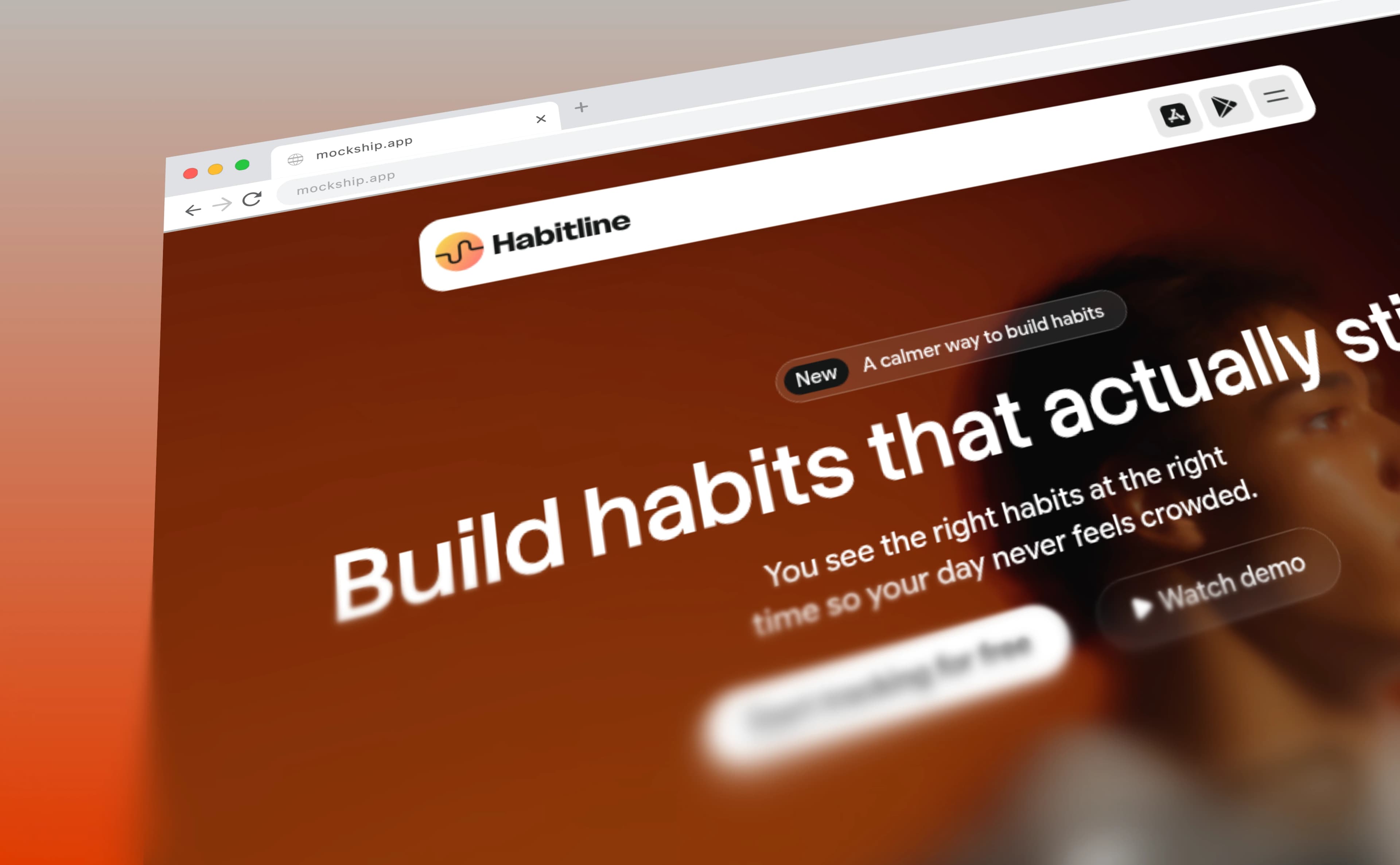
How to Add a Browser Frame to a Screenshot
The window chrome that turns a flat capture into a website — with your own domain in the address bar and your favicon on the tab.

How to Take a Full Page Screenshot That Looks Good
Every browser can capture a whole page without an extension. Here is how, and how to frame the tall image you end up with.
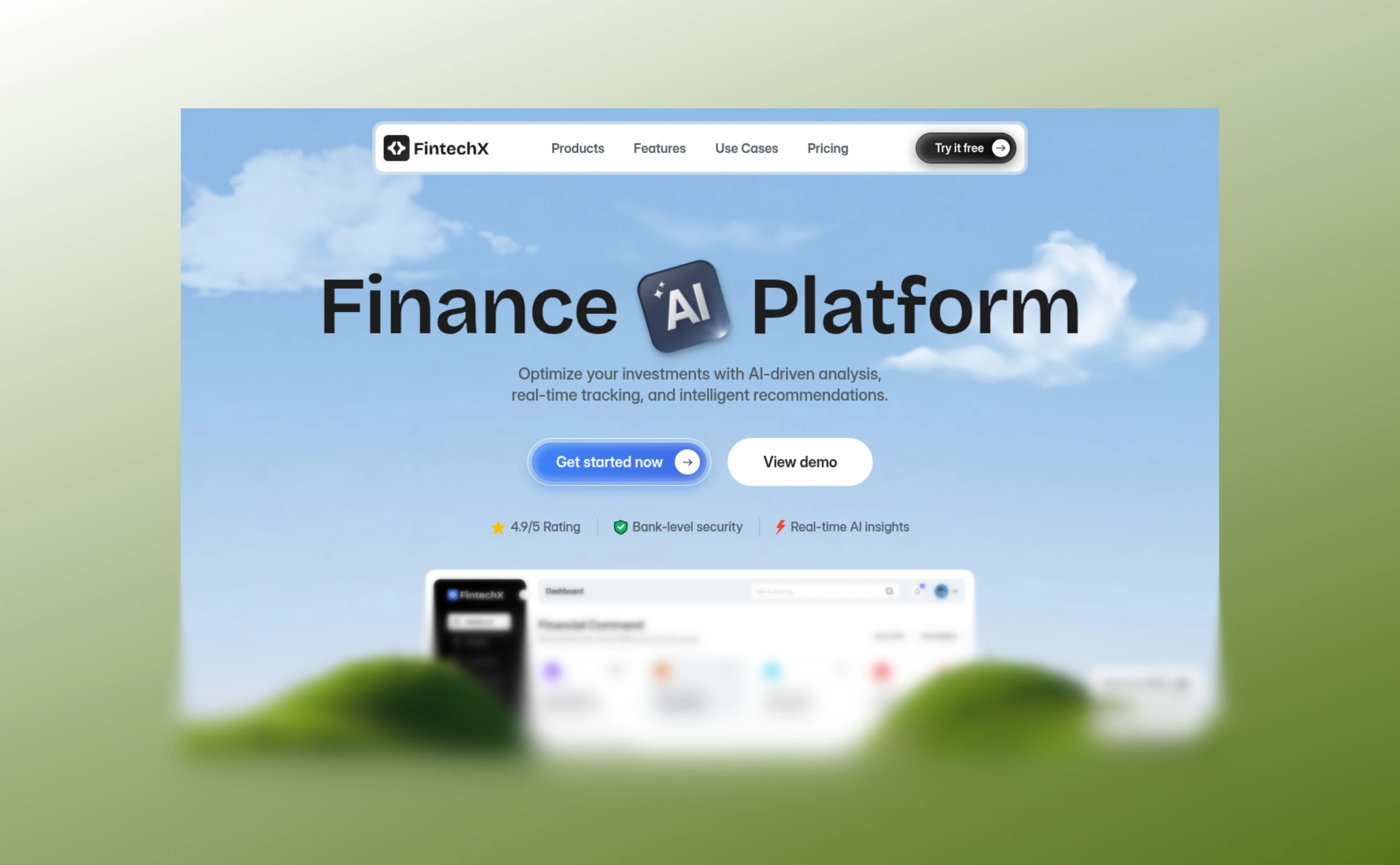
How to Add a Progressive Blur to a Website Screenshot
The gradient blur that fades a long page into the background — what it is for, and the four sliders that control it.